Designing a cozy mobile library that brings all your book-related needs together in one calm, intuitive space.
✨ Overview
- Role
Product & Brand Designer
Lead UI Design, Lead UX Design, Research, Rapid Prototyping, User Flows, Logo Design
- Platform
iOS
- STATUS
In Development
- DELIVERABLES
Design
User Flow, Wireframes, High-Fidelity Prototype, Design System, Branding, Visual Design, Logo
- OVERVIEW
The project focused on contributing to the design and direction of a book-focused mobile app built to be simple, intuitive, and enjoyable to use—a comfort space that functions as a personal mobile library for all book-related needs. The app is inclusive of all genres and reading habits, offering users a safe environment that can be as customizable, private, or social as they prefer.
The idea emerged through discussions with a friend and the broader team, when we noticed we were often reading the same books at different times and repeatedly recommending them to one another. This highlighted the need for a more thoughtful way to track recommendations, organize reading lists, and collect book-related content such as quotes or memes.
I contributed to the product’s naming, branding, and overall experience. The name Shelv was chosen to evoke the familiarity and simplicity of a personal bookshelf, reinforcing the idea of ownership, organization, and comfort. This concept guided the visual identity and design decisions, ensuring the app felt warm, approachable, and intentionally cozy while remaining functional and modern.
✨ Highlights
✨ The Challenge
Problem Framing

Most existing book apps fail to create a cohesive experience that balances personal library management with social interactions. Users are forced to use multiple apps - one for tracking their reading, another for reviews, and various messaging platforms for discussing books with friends.
Additionally, these apps often feel clinical and algorithmic rather than warm and inviting. There's a clear gap in the market for an app that provides both utility and comfort - a space that feels like curling up with a good book while offering powerful tools to enhance the reading experience.
Pinpointing Issues
1
Fragmented Experiences:
Readers juggle multiple apps for tracking, socializing, and discovering books
4
Privacy Concerns:
Insufficient control over what reading information is shared publicly
2
Lack of Personalization:
Limited options for users to customize their reading space to their preferences
5
Missing Social Dimension:
Difficulty sharing reading experiences with friends in meaningful ways
3
Algorithmic Recommendations:
Impersonal book suggestions that don't account for friend recommendations
6
Complex Interfaces:
Overly complicated designs that detract from the reading experience
✨ The Solution
Our Goals
Our solution is a book app that seamlessly integrates personal library management with meaningful social interactions. Shelv creates a cozy digital space where readers can:
Organize their books into customizable collections
Engage in discussions without fear of spoilers
Control privacy settings for what they're currently reading
Create and share book-related content
Share and receive recommendations directly from friends
Discover new reads based on friend activity and personal preferences
All wrapped in a warm, intuitive interface that prioritizes comfort and simplicity.
✨ Research Summary
Market Insights & Competitor Analysis
I conducted an in-depth analysis of the current book app market, focusing on both direct competitors (book tracking apps) and indirect competitors (social media platforms where book discussions happen).
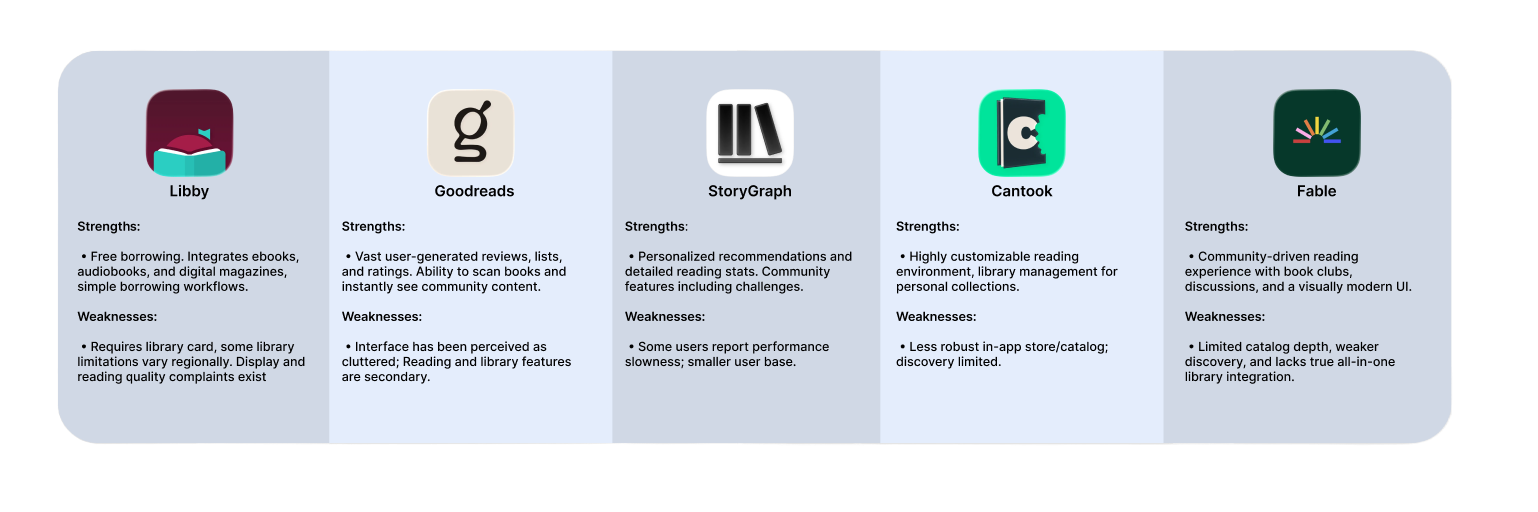
This analysis revealed opportunities to combine the strongest elements of each platform while addressing their limitations to create a more cohesive experience.
✨ Design Process
Tools
Figma
Procreate

Mobbin
XCode
Github
Design Review
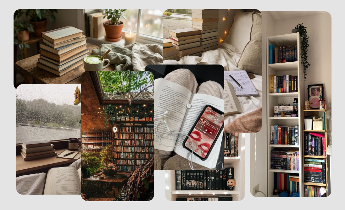
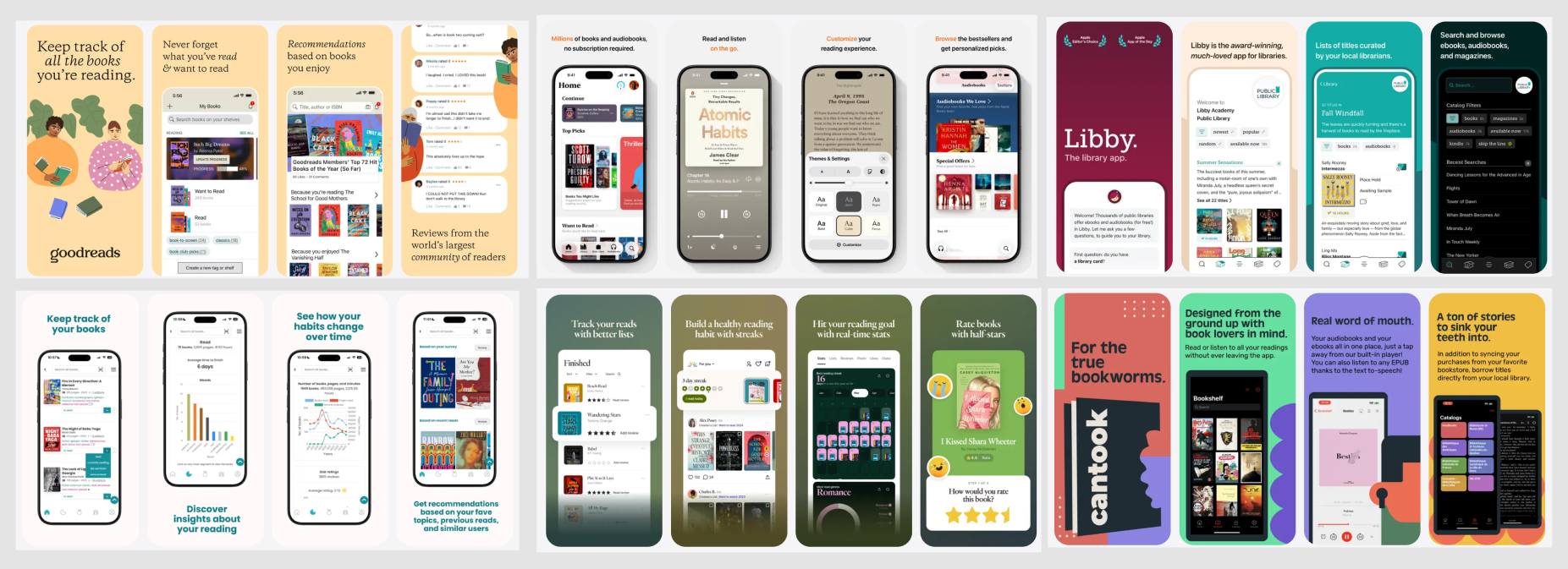
I created extensive mood boards to establish the visual direction for Shelv. I wanted the app to feel cozy and inviting while remaining clean and functional. Using Mobbin, I studied successful UI patterns from both book apps and social platforms with exceptional user experiences.
For visual inspiration, I looked at warm color palettes, comfortable reading environments, and book-related imagery. The aesthetic goal was to create a digital space that feels as inviting as a favorite reading nook. The color palette was inspired by warm sunset tones, creating a sense of comfort and calm that aligns with the feeling of getting lost in a good book.
Ideation
The ideation process began with defining our core features and target users. I focused on balancing the app's dual nature as both a personal library and social platform. Key considerations included:
How to organize books in a way that feels intuitive and personal
Creating meaningful social interactions without overwhelming the user
Implementing privacy controls that are powerful yet simple to use
Designing a discovery system that balances algorithmic suggestions with friend recommendations
Developing a visual language that communicates comfort and coziness
✨ Key Features
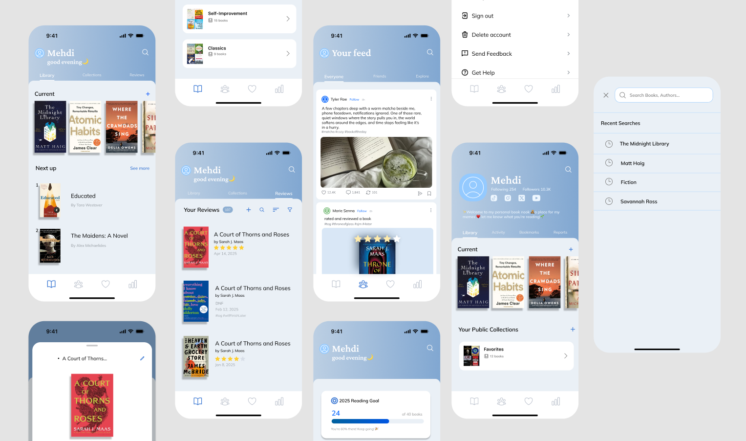
Your Books
The Books section serves as your personal library, with thoughtfully designed features:
🌱 Currently Reading shelf with privacy options
🌱 Custom collections that can be private or shared
🌱 Friend recommendation tracking
🌱 Rating system with custom tags and notes
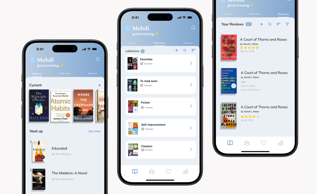
Your Books and Library
Your Feed
The social feed brings readers together:
🌱 Clubs for topic-focused discussions
🌱 Posts from friends and groups you've joined
🌱 Support for text, images, GIFs, and memes
🌱 Built-in spoiler protection
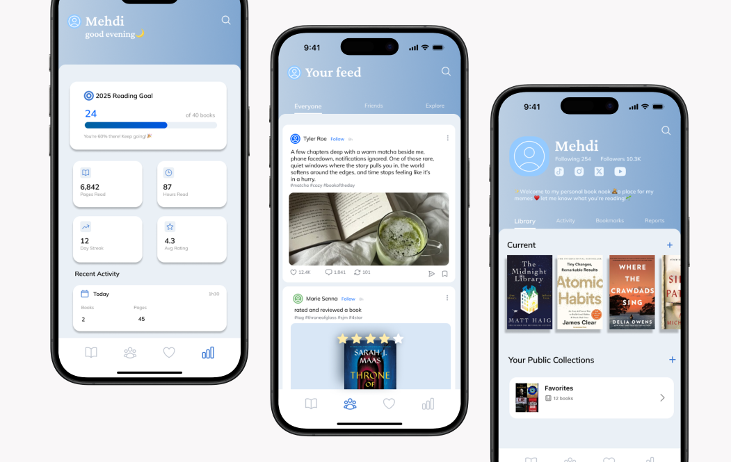
Your Feed
Your Profile
The profile section helps users track their reading journey:
🌱 Reading statistics and habits visualization
🌱 Collection, post history, and bookmarked content
🌱 Privacy controls for what others can see
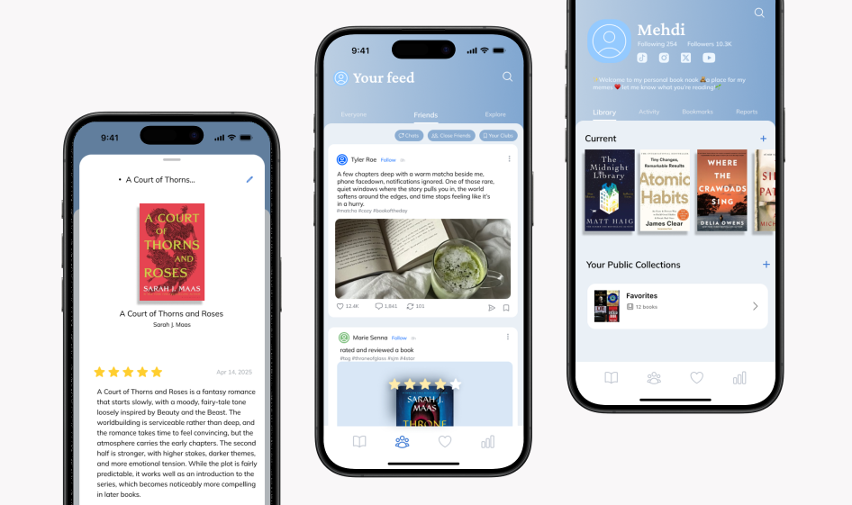
Your Custom Profile
✨ Visual Design
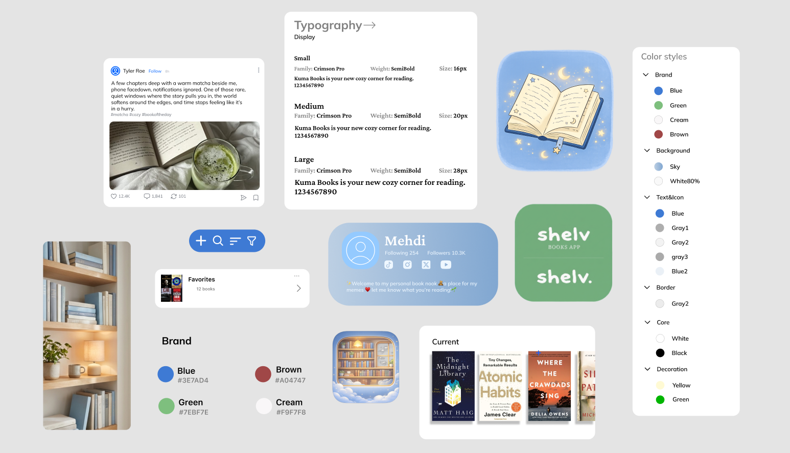
Design System
I created a cohesive design system to maintain visual consistency across the app and support a more efficient development process.
Typography
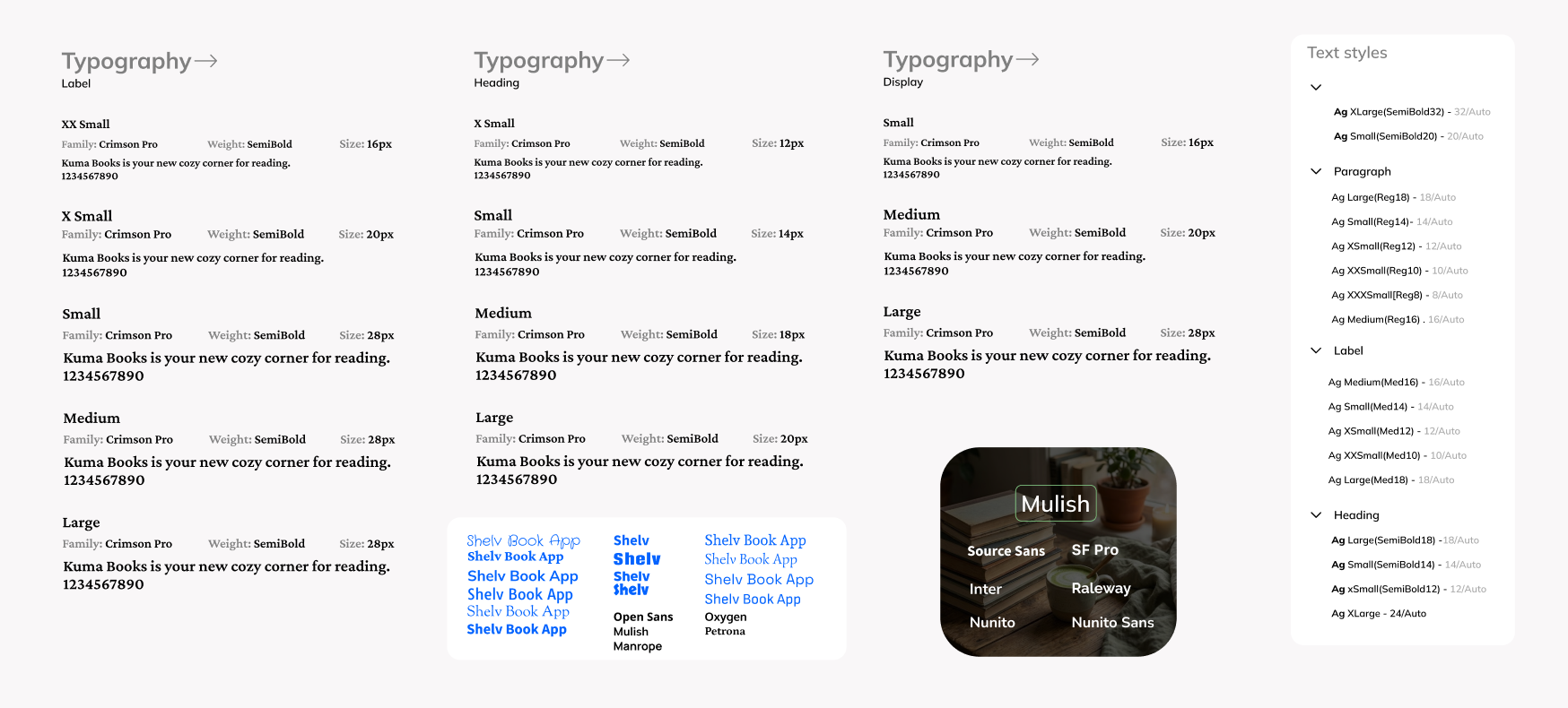
After exploring a wide range of typefaces, I selected two complementary fonts that work harmoniously together:
Crimson Pro: An elegant serif typeface that evokes the feel of printed books, well suited for titles and headings.
Mulish: A modern sans-serif with more personality than typical system fonts, designed for body text and UI elements while preserving strong readability.
Together, they strike a balance between clarity and character, resulting in a typographic system that feels both warm and distinctive.
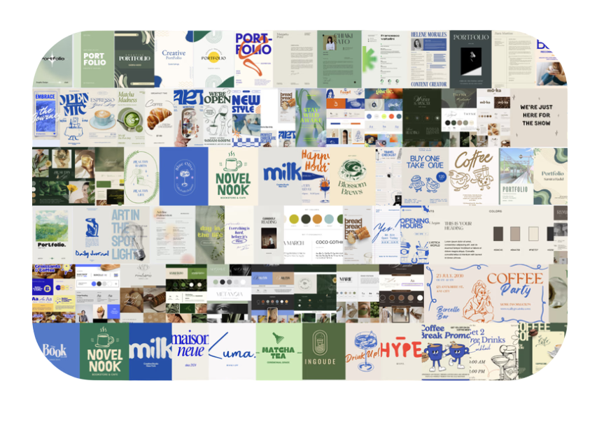
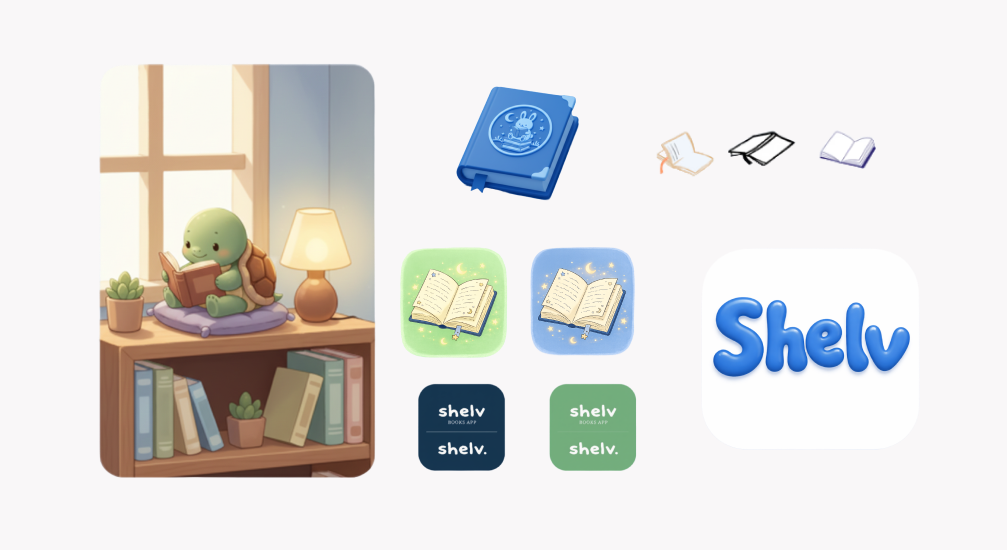
Branding & Illustrations
✨ Reflections
Key Takeaways
Balance is essential:
Creating an app that serves both personal and social needs requires thoughtful design decisions
Cohesive design system:
Investing time in a thorough design system pays dividends in consistency and development speed
Privacy matters:
Readers appreciate granular control over what they share about their reading life
Design for delight:
Small touches of personality transform a functional app into a beloved experience
Competitive analysis insights:
Understanding the strengths and weaknesses of competitors shaped our unique offering
Simplicity wins:
Despite the temptation to add features, keeping the core experience simple remains a priority
Next Steps
Our immediate next steps include:
🌱 Finalizing the development of our MVP features
🌱 Conducting usability testing with a small group of beta users
🌱 Refining the experience based on feedback
🌱 Expanding our custom illustrations for empty states and onboarding
🌱 Preparing for an App Store launch
🌱 Building a roadmap for future feature development based on user feedback
Looking further ahead, we're excited to grow our community features and explore additional customization options that make Shelv feel truly personal to each user.
Thank you for checking out this project !