Building a design system for a crypto wallet app that simplifies expenses on the blockchain
✨ Overview
- Role
Product Designer
UI Design, UX Design, Rapid Prototyping, User Flows, Interaction Design, Illustrations, Wireframing
- Platform
iOS
- STATUS
Shipped to Production
- DELIVERABLES
Design
User Flow, Wireframes, High-Fidelity Prototype, Design System
- OVERVIEW
The project focused on defining the design direction of SPECTR, a crypto wallet built to simplify expense tracking and asset management on the blockchain. The goal was to create a clear and intuitive experience that removes unnecessary complexity while giving users confidence and control over their on-chain finances.
The need for SPECTR became clear as we observed how fragmented existing tools are for tracking crypto expenses. Constantly moving between wallets, explorers, and spreadsheets exposed the lack of a single product that could centralize data and surface useful insights without overwhelming users.
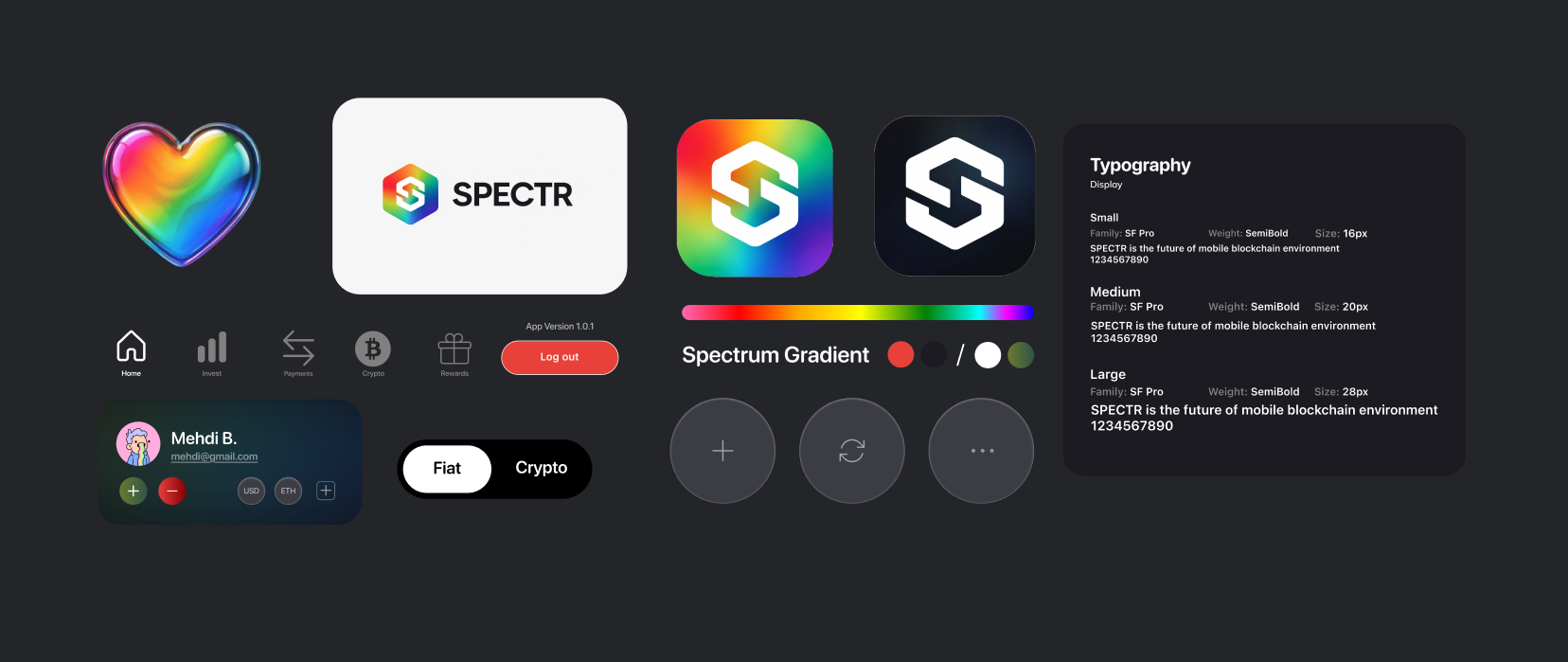
I contributed to the product's naming, branding, and overall experience. The name SPECTR reflects clarity and visibility across on-chain activity and informed a visual identity that feels modern, precise, and trustworthy for both new and experienced crypto users.
✨ Highlights
✨ The Challenge
Problem Framing

Most existing crypto wallets and finance tools fail to provide a cohesive experience that balances everyday asset management with clear, usable insights. Users are often forced to rely on multiple products—one wallet to store funds, blockchain explorers to decode transactions, and external tools or spreadsheets to track expenses and understand their activity.
In addition, many of these apps feel overly technical and transactional, prioritizing raw data over clarity and user confidence. This leaves a clear gap in the market for a crypto app like SPECTR that combines strong utility with approachability, offering a calm, intuitive environment while still delivering powerful tools to understand and manage on-chain finances.
Pinpointing Issues
1
Fragmented Experiences:
Users juggle multiple tools for holding assets, tracking expenses, and understanding on-chain activity.
4
Privacy Concerns:
Insufficient control over what financial activity or wallet information is visible or shared.
2
Lack of Personalization:
Limited ways for users to customize how their wallet data, insights, and views are organized.
5
Missing Context and Clarity:
Difficulty understanding where funds are going and what transactions actually represent.
3
Data-Heavy Insights:
Raw transaction data that lacks context and does not reflect real spending behavior.
6
Complex Interfaces:
Overly technical designs that make managing crypto feel intimidating and unnecessarily complicated.
✨ The Solution
Our Goals
Our solution is a crypto wallet that brings asset management and expense tracking into a single, cohesive experience. SPECTR creates a clear and approachable environment where users can:
Track and categorize on-chain expenses in one place
View transactions with added context and clarity
Control privacy around wallet activity and shared data
Organize assets and activity in customizable views
Gain insights into spending patterns and financial behavior
Understand their on-chain activity without relying on external tools
All delivered through a modern, intuitive interface that prioritizes clarity, confidence, and simplicity.
✨ Research Summary
Competitor Analysis
I conducted an in-depth analysis of the current crypto wallet landscape, focusing on both direct competitors (crypto wallets and expense tracking tools) and indirect competitors (platforms and services used to understand and discuss on-chain activity).
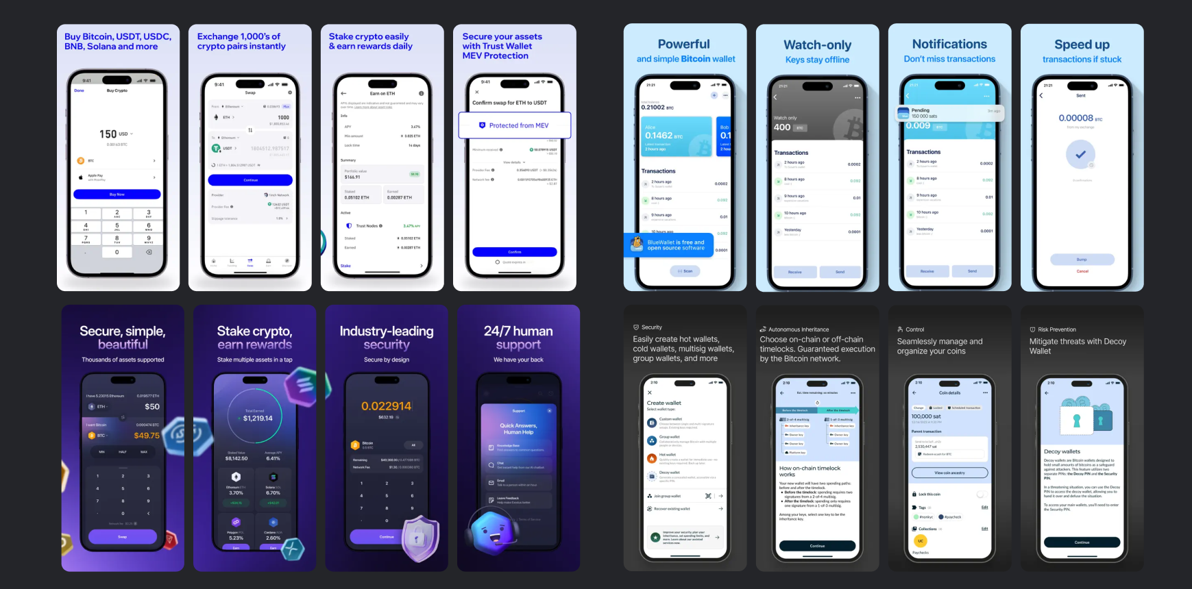
This analysis revealed opportunities to combine the strongest elements of existing crypto tools while addressing their limitations to create a more cohesive experience.
Market Insights
I concluded the market analysis by evaluating leading iOS crypto wallets such as BlueWallet, Exodus, Nunchuk, and Trust Wallet. While each product is strong in security and asset management, most lack clear expense categorization, human-readable transaction context, and meaningful insights into spending behavior. This highlighted an opportunity to build SPECTR around clarity, usability, and financial understanding rather than raw blockchain data alone.
✨ Design Process
Tools
Figma
Procreate

Mobbin
XCode
Github
Moodboarding
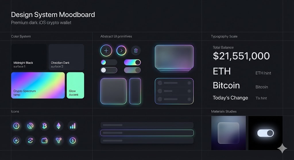
Ideation
The ideation process began by defining SPECTR's core features and target users, with a focus on balancing financial utility and everyday usability. Key considerations included:
Organizing on-chain activity in a way that feels intuitive and easy
Presenting financial insights without overwhelming users with raw data
Implementing privacy controls that are powerful yet simple to manage
Designing clarity-first views that help users understand spending behavior
Developing a visual language that communicates trust, calm, and precision
✨ Key Features
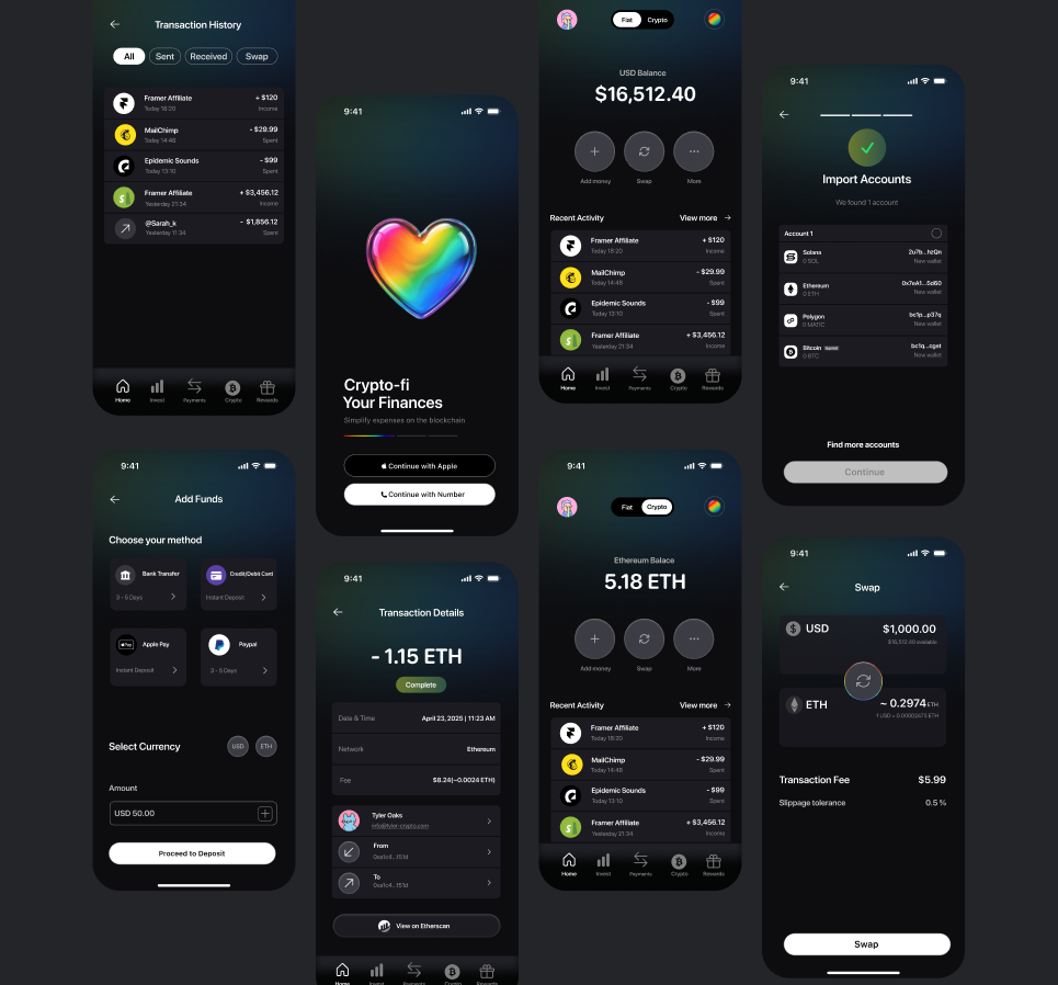
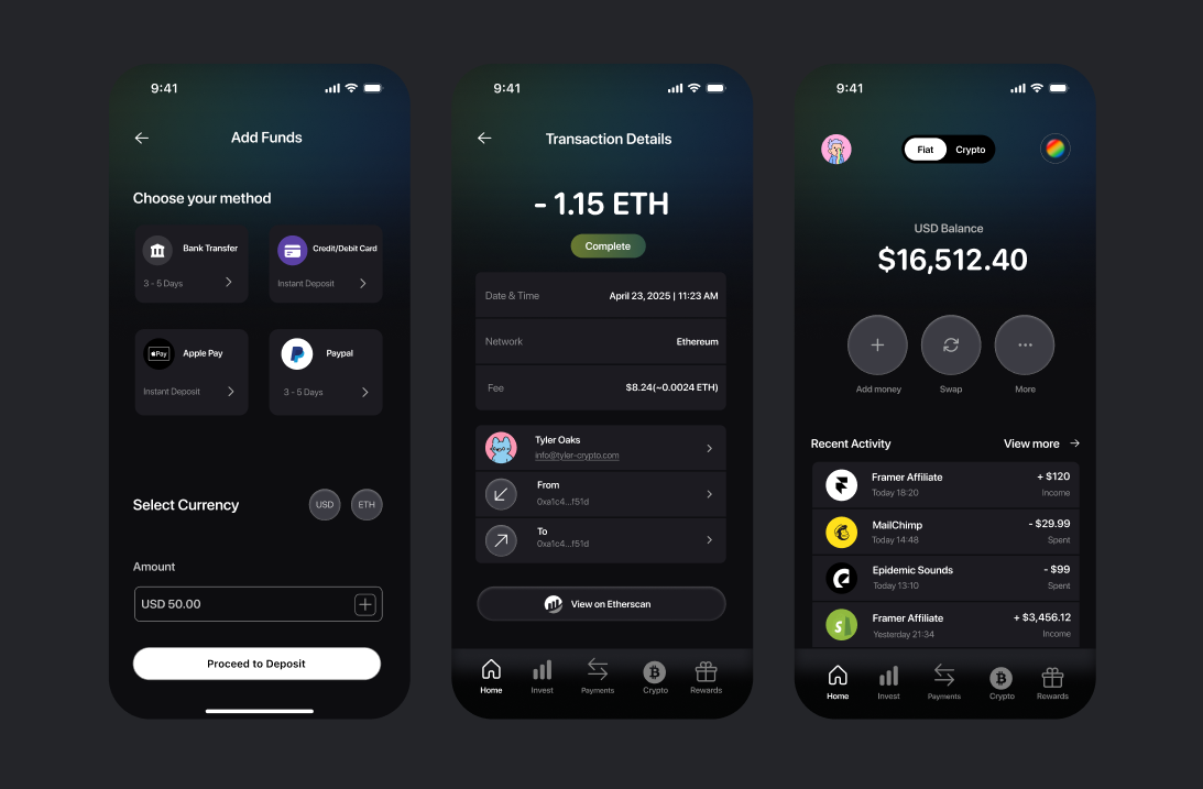
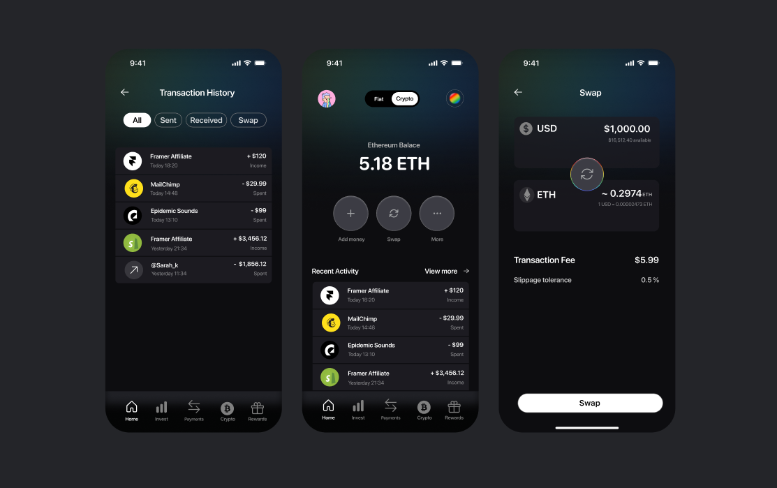
Your Assets
The Wallet section serves as your crypto management hub, with thoughtfully designed features
🪙 Send and receive crypto
🪙 Transaction details and history
🪙 Adding funds to your wallet
🪙 Swapping crypto seamlessly
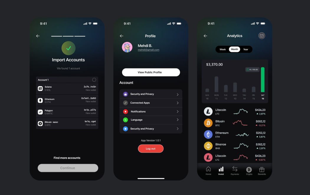
Your Activity
The activity section brings your transactions to life:
🪙 Import accounts from multiple networks
🪙 Support for text, images, GIFs, and memes
🪙 Full analytics and insights
Your Profile
The profile section helps users track their crypto journey:
🪙 Portfolio statistics and transaction history
🪙 Holdings, activity history, and saved content
🪙 Privacy controls for what others can see
✨ Reflections
Key Takeaways
Balance is essential:
Creating an app that serves both personal and social needs requires thoughtful design decisions
Cohesive design system:
Investing time in a thorough design system pays dividends in consistency and development speed
Privacy matters:
Readers appreciate granular control over what they share about their reading life
Design for delight:
Small touches of personality transform a functional app into a beloved experience
Competitive analysis insights:
Understanding the strengths and weaknesses of competitors shaped our unique offering
Simplicity wins:
Despite the temptation to add features, keeping the core experience simple remains a priority
Next Steps
Our immediate next steps include:
🌱 Finalizing the development of our MVP features
🌱 Conducting usability testing with a small group of beta users
🌱 Refining the experience based on feedback
🌱 Expanding our custom illustrations for empty states and onboarding
🌱 Preparing for an App Store launch
🌱 Building a roadmap for future feature development based on user feedback
Looking further ahead, we're excited to grow our community features and explore additional customization options that make Shelv feel truly personal to each user.
Thank you for checking out this project !